Layouts - Page 3

Advice for crafting layouts and structure that can create a clear, original web design. Break the mould, and build a unique layout!

10 Ways to Simplify Your Design

Minimalist Graphic Design / 25 Jul 2018

10 Ways to Simplify Your Design

It’s no secret that simple is often better when it comes to website design. An interface that’s simple to understand—and just as simple to use—is more likely to turn visitors into active users who will return to your site later.

But how do you simplify your website? Even if you aren’t building something new from scratch, the trick is to set goals and then look at the path to reaching them for users. Anything that gets in the way of that path should be eliminated. Anything that makes understanding what a user is supposed to do should be removed from the design.

That’s what we’re going to look at today – a few tricks that you can use to simplify your website design. And these ideas work for existing sites and new builds. (This article features examples of stellar simple designs, visit each site for even more inspiration.)
7 Tips for Designing a Large Footer

Layouts / 28 Jun 2018

7 Tips for Designing a Large Footer

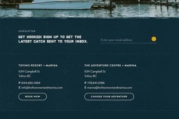
Not all website footers are made equal. While footer design might not be a sexy part of the web design process, a great footer can help users find information, contact you, and better engage with a website. Here’s how you design one that’s functional, and beautiful.

A large footer can also help organize information and make navigating a complicated website that much easier – think about the massive, multi-layer footer on Amazon’s website.

The trick to a large footer is content organization. Once you figure out what the footer design should help users do, it is easier to design a bottom-of-the-page element that you can be proud of. Let’s dive into some footer design tips.

7 Tips for Creating a Time-Saving Design for Users

Layouts / 30 Mar 2018

7 Tips for Creating a Time-Saving Design for Users

Users have short—very short—attention spans. That’s probably evident just looking through your website analytics. This makes it more important than ever to deploy design techniques that help users scan and get the most information from your website in the shortest time possible.

It is your job to understand what users need to glean from the design at a glance and help them get that information, so maybe they’ll stick around and explore your website. Here are a few ways to do it!

10 Web Design Commandments for Every Project

Layouts / 21 Mar 2018

10 Web Design Commandments for Every Project

Do you have a rulebook when it comes to website design? There are some rules that apply to pretty much every web design project—let’s call them the “web design commandments”.

No matter how large or small the website, these rules are the foundation for good design. If you follow along with these basic guidelines, and make them part of your thinking for every project you start, you’ll avoid many of the pitfalls that designers can stumble into!

10 Tips for Designing Landing Pages That Don’t Suck

Layouts / 15 Mar 2018

10 Tips for Designing Landing Pages That Don’t Suck

A landing page is the first experience your customer (or potential customer) will have with your brand. It has to convey information, encourage a call-to-action, and reflect your personality. It’s difficult! Today we’re sharing ten landing page design tips to help.

If you just stick your logo and product image on a template, it’ll be obvious. The page won’t provide the experience or information your customer expected when getting there. Whether it is hard to navigate, difficult to read, or a mess of visuals, designing a landing page that doesn’t suck takes planning and precision. Let’s take a look at ten tips on how to do it better.

Design Trend: Open Concept Layouts

Graphics / 17 Jan 2018

Design Trend: Open Concept Layouts

If you watch any home improvement shows on television, the most repeated phrase might be “open concept layout.” Did you know you can DIY your way to an open-concept layout in website design as well? This design trend is more than just a home improvement idea.

Open concepts are a fun, and functional, visual pattern that can help users navigate your website while controlling digital clutter. Here’s how you do it with 10 mini case studies and examples!

7 Ways to Ensure Your Long-Scrolling Website Is Successful

Layouts / 20 Dec 2017

7 Ways to Ensure Your Long-Scrolling Website Is Successful

The old keep-it-above-the-scroll manta isn’t always what your content – and design – needs. Here are seven ways to create a long-scrolling website that will keep the attention of users, and hopefully keep them scrolling.

Long-scrolling can be a stellar way to engage users. Sometimes the best visual presentation possible doesn’t happen entirely above the scroll. Long-scrolling formats are websites that scroll multiple times to capture that content. Let’s put the often-debated concept to rest. Today’s users understand how and when to scroll.

Parallax Effects Compared: 5 Choices to Consider

Layouts / 13 Nov 2017

Parallax Effects Compared: 5 Choices to Consider

Parallax effects remain one of the hottest web design trends. This animated scrolling technique happens when background and foreground move at different speeds while the user scrolls so that there are two independent layers moving at the same time.

This effect can be used for any number of website types and is a fun way to create – and increase – user engagement. The nice thing about parallax effects is that you don’t have to use them on every page of a design; parallax scrolling is a great homepage technique to help drive users to calls to action or other content.

Parallax effects create an element of depth and distance and a greater sense three-dimension than some other techniques, making users feel like part of the design.

The downside to parallax effects is that they don’t always work on mobile devices. (But there are some workarounds for that as well in the tutorial at the end of this article.)

Here are five parallax effects and styles to consider. (Make sure to click through the links to see exactly how each animation works.)

Design Trend: Dark Color Palettes & Animation

Graphics / 1 Nov 2017

Design Trend: Dark Color Palettes & Animation

Have you taken note of all the super dark design patterns lately? Designers are experimenting with some funky, dark design patterns that feature animation in the same color scheme.

These animations include everything from simple movements that happen on their own, to hover effects and full cinematic experiences. Let’s dive into this website design trend and explore a few ways to make it work for your projects.

Coming Soon Landing Pages: Tips and Best Practices

Layouts / 11 Oct 2017

Coming Soon Landing Pages: Tips and Best Practices

What do you do when your website is under construction and you aren’t quite ready for launch?

Whether you’re generating buzz to release a new product or app, or just waiting for a new website project to be ready, a coming soon page can be the fix.

When used well, coming soon pages can help generate leads (with an email signup form) and drum up some interest for your website.

7 Tips for Creating a Website Header That Wows

Graphics / 31 Jul 2017

7 Tips for Creating a Website Header That Wows

A website header is often the first thing that a user sees. It can make or break the user experience, your branding, and much more!

To help retain users and keep them moving through the design, you need to create a website header that wows. And not just on the homepage. On every single page of the design. (Remember, a significant number of users don’t go to your homepage first.) Here’s how you do it.

Flat Design: An Evolving Trend

Graphics / 14 Jun 2017

Flat Design: An Evolving Trend

Is the flat design trend finished? We don’t think so. It’s not dead yet. But the trend has evolved to be less stark and more engaging for users.

The early days of flat design were marked by a complete lack of design elements such as shadows, gradients, or realistic elements with texture. Many of those design elements are back, but are being paired with the overall idea of flat design to create a website user experience that’s both simple and easy to engage with. Depending on what side you are on, it might be a better version of flat design.

Here’s a look at the flat design trend evolution, and where we are today.