Typography - Page 3

Learn how to work with fonts, lay out typography, pair different typefaces, and find collections of inspiring fonts to use in your next project.

Pixel Art & Pixel Fonts: How to Work With This Timeless Design Trend

Graphics / 13 Mar 2023

Pixel Art & Pixel Fonts: How to Work With This Timeless Design Trend

You may have noticed a lot of pixelation on the web lately. And it is by design.

Pixel art and pixel fonts – a design element that’s not necessarily new – are making a trending comeback. Pixel art and fonts often refer to some of the same elements – designs sometimes contain pixel type or design elements with non-pixel elements. The overall look has a “beginning of the web” feel.

Here’s a look at this website, font, and graphic design trend and how to use it in your projects.

Font Psychology: How to Use It to Create Persuasive Designs

Font Collections / 9 Feb 2023

Font Psychology: How to Use It to Create Persuasive Designs

You’ve likely heard the phrase “a photo is worth a thousand words.” If that’s true, then so is a typeface.

Font selection can greatly impact what you say through design and how easy it is to read, as well as the emotion and human psychology attached to it.

Even though words are meant to be read, they are also looked at and establish a visual connection.

Today we’re diving into the idea of the psychology of fonts, and how to use them to impact what message your design conveys.

4 Quick Tips for Using Outline Fonts

Font Collections / 7 Feb 2023

4 Quick Tips for Using Outline Fonts

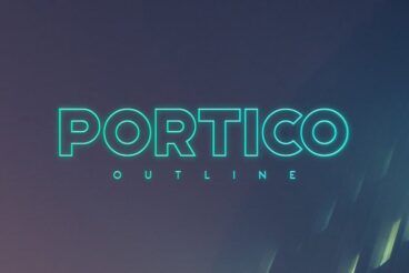
If you’re working on a poster, flyer, or greeting card design, an outline font is a great choice for adding titles and headlines that attract attention. In this post, we’re featuring tips for working with outline fonts to make the most of their unique characteristics.

Unlike most other types of fonts, an outline font is easily recognizable. Just as the name suggests, an outline font features a character design that only consists of outlines without a fill. These fonts are widely used to create attractive titles and headlines. They are also used in logo and stationery designs as well.

Follow these tips when using outline fonts in your designs to make them look more professional.

The 2024 Guide to Responsive Typography Sizing and Scales

Typography / 31 Jan 2023

The 2024 Guide to Responsive Typography Sizing and Scales

The true responsiveness of your website design is more than a framework that scales to each device, it also requires that typography adjusts to optimum readability as well.

Responsive typography will adjust so that text elements also change size and scale on websites. While that’s the technical answer, there’s also a greater design approach that is equally important, because just changing the size of a text element isn’t always enough.

Let’s dive into responsive typography best practices, a few guidelines, and some tools to help you create great type at any size.

55+ Bold & Free Script Fonts 2024

Font Collections / 24 Nov 2022

55+ Bold & Free Script Fonts 2024

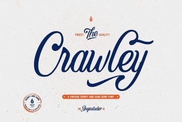
Today we’re featuring some of the best free script fonts from across the web. We’ve hand-picked bold script fonts with impact, that can be a stand-out choice for your next project.

Fonts don’t always need to be expensive. In fact, it’s hard to believe that the fonts in this collection are actually free to use.

We handpicked these bold script fonts from all around the web, so be sure to check the license and attribution details before using them with your client and commercial projects.

Cursive vs. Script Typography: Which Is Better?

Font Collections / 7 Jul 2022

Cursive vs. Script Typography: Which Is Better?

Typography is an art form with a rich history. If you ask any experienced designer, they’ll agree with you immediately that typography is much more than just font pairing and choosing good-looking typefaces.

Much like picking the right colors and arranging content in a layout, typography also plays an important role and has strong psychological effects on every design. The debate between cursive and script fonts is quite the same.

On the surface, they may look very similar but cursive and script are two different fonts used in different types of designs. While some designers prefer script fonts over cursive and vice versa, it’s not just a matter of preference. It’s mainly about which font is appropriate for the overall design.

Let’s explore this topic and end this cursive vs. script debate once and for all by figuring out which type of font is better.

How to Choose the Right Font for Readability

Font Collections / 24 Jun 2022

How to Choose the Right Font for Readability

It’s an age-old question: What is the best font for a website design?

Depending on who you ask, you might get an answer that includes a specific typeface. (Designers will joke about using Helvetica for everything, but it’s doubtful as a best practice.)

The more likely question is this: What is the most readable font for a website design? And the answer is rooted in core design principles that can help you choose a beautiful, and highly readable, typeface.

Here’s how you choose the right font for readability (with examples of great font choices for inspiration).

Choosing the Best Font for PowerPoint: 10 Tips & Examples

PowerPoint Templates / 22 Apr 2022

Choosing the Best Font for PowerPoint: 10 Tips & Examples

There’s a fine art to creating a great PowerPont presentation that wows. With so many tricks and features in this little bit of software, it’s more likely to see a bad presentation than a good one (and you don’t want to be that person!)

While there are a lot of factors that contribute to the overall design, choosing a suitable font for PowerPoint is near the top of the list. The audience needs to be able to read the words on the screen with ease, to ensure that your presentation is as effective as possible.

So how do you do it? Where do you start when choosing a font for PowerPoint? We have 10 tips for you with a few examples of PowerPoint slides (and templates) that will impress your audience.

Design Trend: Text That’s Not Readable

Trends / 4 Feb 2021

Design Trend: Text That’s Not Readable

Let’s start with a definition. Readability is a measure of how easy a piece of text is to read. The level of complexity of the text, its familiarity, legibility, and typography all feed into how readable your text is. Readability is a key factor in user experience.

Why would we ever showcase a design trend that features text that’s not readable? Simply, because it is popular. Does it mean that it’s a good idea? It… depends!

You can read on, look at the examples, and decide if it is right for your projects.

Web Typography Rules: What You Need to Know

Font Collections / 7 Dec 2020

Web Typography Rules: What You Need to Know

90% of all the information on the web is in writing. That means that typography is a skill that dictates that 90%. That’s a staggering figure that highlights just how important typography is.

It’s absolutely everywhere: blog posts, social media, magazines, reports, books, and so much more.

What this means for you as a designer is that text is your primary means of communication. If you haven’t got your typography skills down, then you’re not going to be able to deliver your ideas to your audience.

Luckily for you, we’ve got a list of useful tips and rules that you can follow to avoid that happening. Even if you’re not the best at typography, follow the information that we’ve laid out here, and you’re going to be fine.

9 Reasons Why You Should Use Open-Source Fonts

Typography / 12 Oct 2020

9 Reasons Why You Should Use Open-Source Fonts

This is a love letter of sorts to an underrated design tool: open source fonts. Open source fonts are licensed in such a way that anyone can use them for any project at no cost.

Many open source fonts come with the standard Open Font License (you can find it here), and it gives you huge flexibility in how you can use them, the types of projects they are suitable for, and how they can be distributed.

There are plenty of reasons to try open source fonts for projects online and in print. And every typeface featured in this post is open source!

Serif vs. Sans Serif Fonts: Is One Really Better Than the Other?

Font Collections / 23 Sep 2020

Serif vs. Sans Serif Fonts: Is One Really Better Than the Other?

There is an ongoing debate among designers – both print and digital – about what makes an ideal typeface for a project. The debate almost always breaks down to a single question: serif or sans serif?

Before you answer that question, think about all of the things you know about serif and sans serif typefaces and all the myths associated with them.

Today, we’ll take a look at both categories of type and try to determine if one is really better than the other, and in what circumstance.